Chosen theme: Mindful Use of Texture in Design. Explore how intentional surfaces shape emotion, usability, and storytelling across brands, products, and interfaces. Join the conversation, share your tactile discoveries, and subscribe for weekly texture studies.
How Texture Shapes What We See, Feel, and Trust
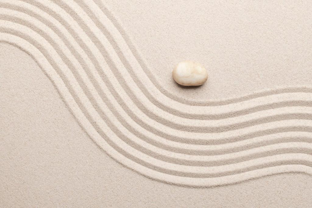
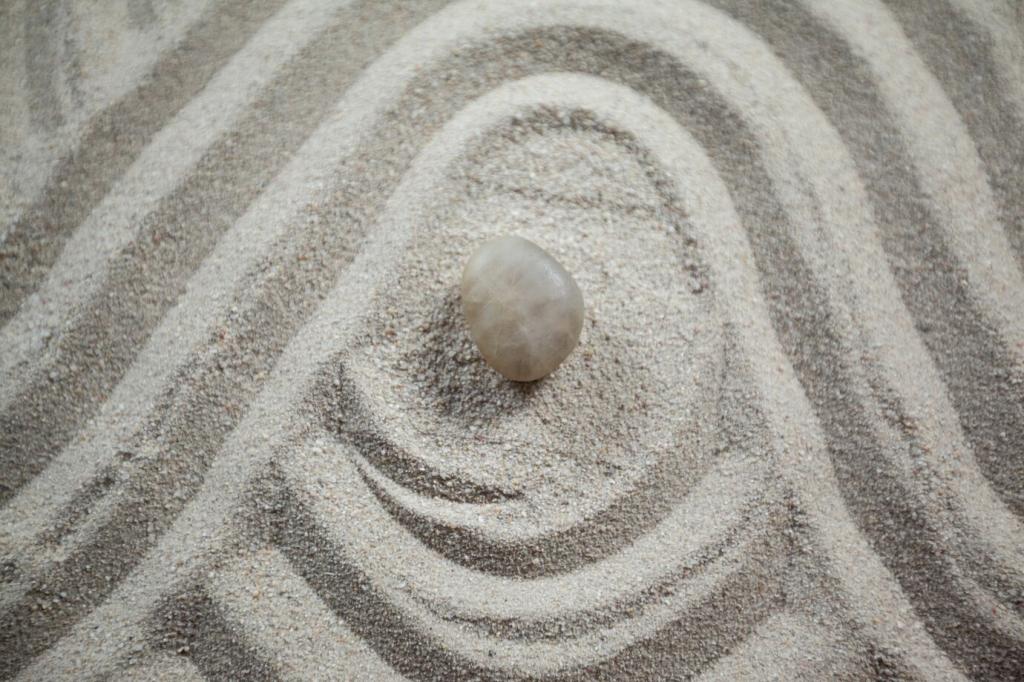
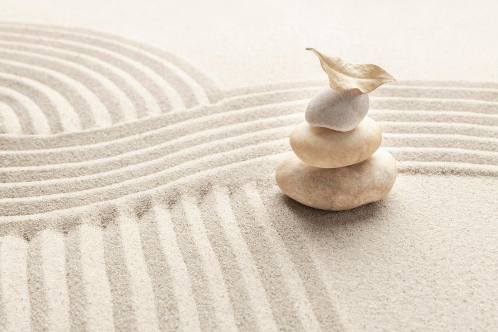
Our brains infer touch from sight; a matte ceramic photograph reads cooler and calmer than a glossy plastic. Mindful texture choices quietly steer expectations, reducing friction and building trust before interaction begins.
Minimalism Meets Texture: Creating Calm, Not Clutter
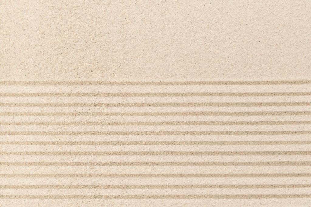
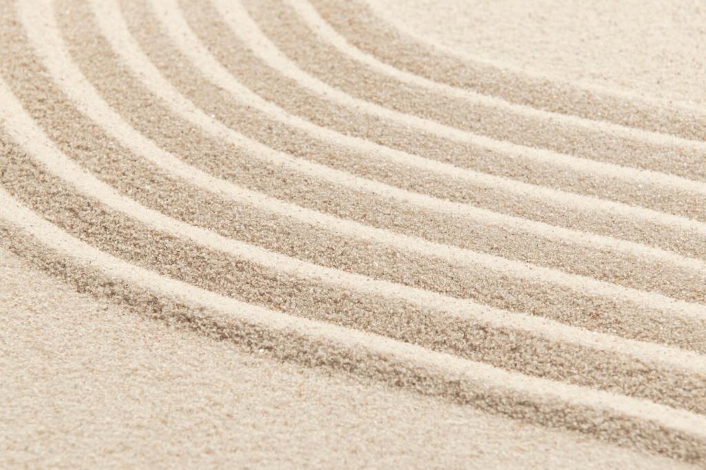
Minimal interfaces and interiors benefit from fibers, linens, and micro-sanded finishes that whisper rather than shout. Low-contrast grains add warmth and hierarchy without stealing focus, keeping breathing room for content and conversation.
Minimalism Meets Texture: Creating Calm, Not Clutter
A hint of brushed metal around interactive edges can signal grip or clickability. By placing tactile emphasis only where it aids action, you sustain a gentle rhythm that respects attention and reduces decision fatigue.
On devices, subtle haptic micro-patterns and case textures can differentiate controls by feel, aiding motor-impaired users. In physical products, graded roughness along edges guides safe handling without reliance on color alone.
High-gloss beside matte creates a readable edge even when hues match. Pairing temperature cues—cool metal with warm cork—adds multisensory redundancy, making navigation and orientation safer for users with low vision or fatigue.
A clinic added ribbed floor bands leading to reception and smooth zones near seats. Anxiety dropped, queue flow improved, and children followed the ribbing playfully—proof that mindful texture can orient, calm, and delight simultaneously.
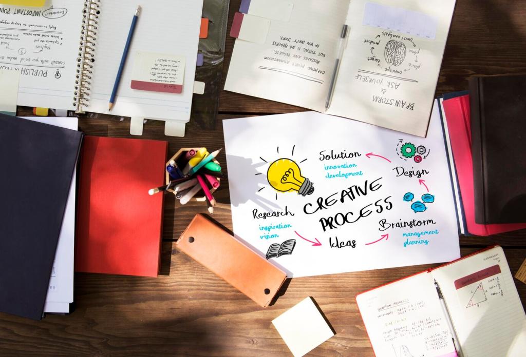
Sample Walls and Blind Tests
Build boards that mix candidates without labels, then run five-second impressions with stakeholders. Ask for feelings, not ratings. The right texture earns words like calm, clear, or trustworthy before anyone mentions style.
Digital Mockups with Material Scans
Photogrammetry and PBR scans translate real surfaces into accurate digital previews. Test how textures compress, crop, and scroll, ensuring that mobile breakpoints preserve legibility and avoid shimmering or banding under motion.
Gathering Feedback Mindfully
Invite users to touch, pause, and describe sensations in their own words. Record metaphors—cloud, slate, linen—because those inform brand language later. Encourage comments below and subscribe to join our monthly texture test roundup.
A kraft-like paper sleeve can echo in app backgrounds as a gentle fiber noise. When physical and digital textures harmonize, recognition increases and transitions feel continuous, not jarring, across the customer journey.
Texture as Brand Voice: From Packaging to Pixels
Create a palette: fine, medium, and bold grains, each assigned to a purpose—information tiers, interaction states, or product lines. Consistency lets teams move fast while keeping experiences coherent, humane, and unmistakably yours.
Texture as Brand Voice: From Packaging to Pixels
Five-Second Texture Audit
Open any screen or walk into a room. In five seconds, can you describe the intended feel? If not, reduce competing grains, increase negative space, and clarify one tactile cue that leads gently.
Avoid texture walls of noise by alternating emphasis with silence. Repeat a grain sparingly across touchpoints, then give eyes and hands rest. Rhythm builds trust, and rests keep curiosity alive without overwhelm.